Long Island graphic design agencies are no strangers to color theory. It’s used to inform designs and subtly influence consumers to feel a certain way about a product or brand. Learn some ways that it can work for your branding strategy.
How our Long Island Graphic Design Agency uses Color Theory
An Introduction to Color
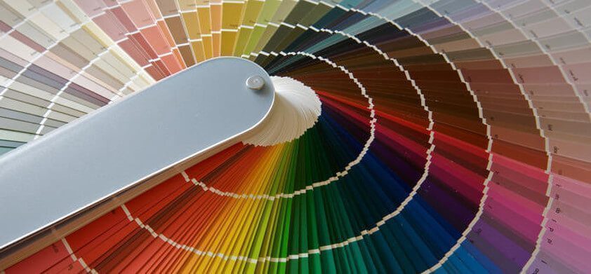
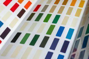
Color plays a fundamental role in the psychology behind advertising and marketing. It’s essential that you learn some of the basic color terms you will need to know in order to create your graphic designs.
There are three primary colors in the color wheel: red, blue and yellow. If any two of these three colors are mixed together, it will produce a secondary color like green, which is blue crossed with yellow. Then, when a primary and secondary color combine, a tertiary color like magenta, which is made from red and purple, will result.
There are other terms associated with color that are helpful to know.
- Hue is just another word for “color” or “shade.”
- Saturation refers to the distinct richness of a color. For instance, a neon color is high in saturation, while a dull pastel is not.
- Value is the measure of a color’s brightness. It is usually represented by a percentage between zero and 100.

Its Effect on Branding
Color is used to establish and characterize brands. Take a moment and think of a popular brand. What do you see? We will venture to guess that the first thing you pictured was the company’s logo or its distinct color scheme.
Next, is there a certain feeling that resonates from it? If there is, then that company’s intention of relaying emotion succeeded. That’s how brands differentiate themselves from competitors.
Whether we recognize it or not, there are certain feelings and emotions that people subconsciously associate to each color. Long Island graphic design experts, like us, recognize the benefits of this strategy and use it in their own design.
Color at Work
Consider the sayings “green thumb” and “true blue.” If someone is called a “green thumb,” it means that they’re adept at prosperously growing plants. If someone is “true blue,” then they’re thought to be trustworthy.
Both of these associations stem from the idea that green is related to growth, nature and money, while blue can mean loyalty and trustworthiness. Companies take advantage of these distinctions to create certain feelings around their brand.
Real World Examples
Think about Starbucks and Whole Foods. They use the color green so people will see them as growth-driven and eco-centric. Also, consider Lowe’s and American Express, who use blue to relay a sense of dependability.
Determine how you want your brand to be perceived. Choose the color(s) that corresponds to that feeling and proceed with the rest of your graphic designs.

Knowing your Audience
Believe it or not, men and women differ when it comes to the appeal of colors. This distinction can come in handy when you’re trying to market to a gendered target audience.
- Studies have shown the men are drawn to the colors blue and green, while women prefer red and purple.
- Their dislikes are even different. For instance, men dislike brown, orange and purple, but women are turned off by orange, gray and yellow.
Long Island graphic design experts, like Fat Guy Media, work with color theory every day. If you’re looking to best serve your brand, you should, too!