Your business’ website is a digital representation of your brand—a 24-hour, online storefront that is often the first impression potential customers have of your company. These web design ideas can help make that first impression a positive, memorable one.
3 Great Stylistic Web Design Ideas
1. Clean and Modern
In recent years, web design for companies with highly professional brand personalities has taken a turn towards clean, minimalistic aesthetics. This design, with crisp fonts and no distracting elements, serves as a digital handshake—almost like a formal introduction from the business to the website visitor.
A clean, simple interface also prioritizes user-friendliness above all else. People visiting your website will likely have questions about your business and its products or services. A no-frills design will allow them to navigate to the content they’re looking for without any distractions.
Example: Mile High Golf Trail, an incredible-looking Colorado golf course. Its simple imagery, legible fonts and easy navigation make this site a great source of inspiration.

2. Fun and Friendly
Vivid color schemes, tastefully-vibrant typefaces and amusing animations are perfect for companies with fun, lighthearted brand personalities. It makes your business appear friendly and approachable to visitors.
When it comes to fun website design, it’s still critical not to sacrifice user experience just for the sake of being creative. No matter how lively your website is, it’s not going to deliver real business results if users can’t navigate it.
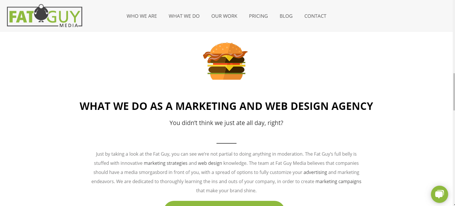
Example: Fat Guy Media. Excuse the humble brag on our own list of web design ideas, but our website is the result of meticulous planning and design. We have playful, food-related elements and color palettes that reflect our brand, but still make it easy for users to find the information they need.

3. Retro
Although it aims to capture product and newspaper design elements that are reminiscent of times between the 1920s and 1980s, retro web design has truly become popular in recent years. It’s often used for apparel and lifestyle brand websites.
Retro websites rely on vintage-looking elements, like classic typography, specific textures and filtered photographs to arouse a sense of nostalgia and familiarity in website visitors.
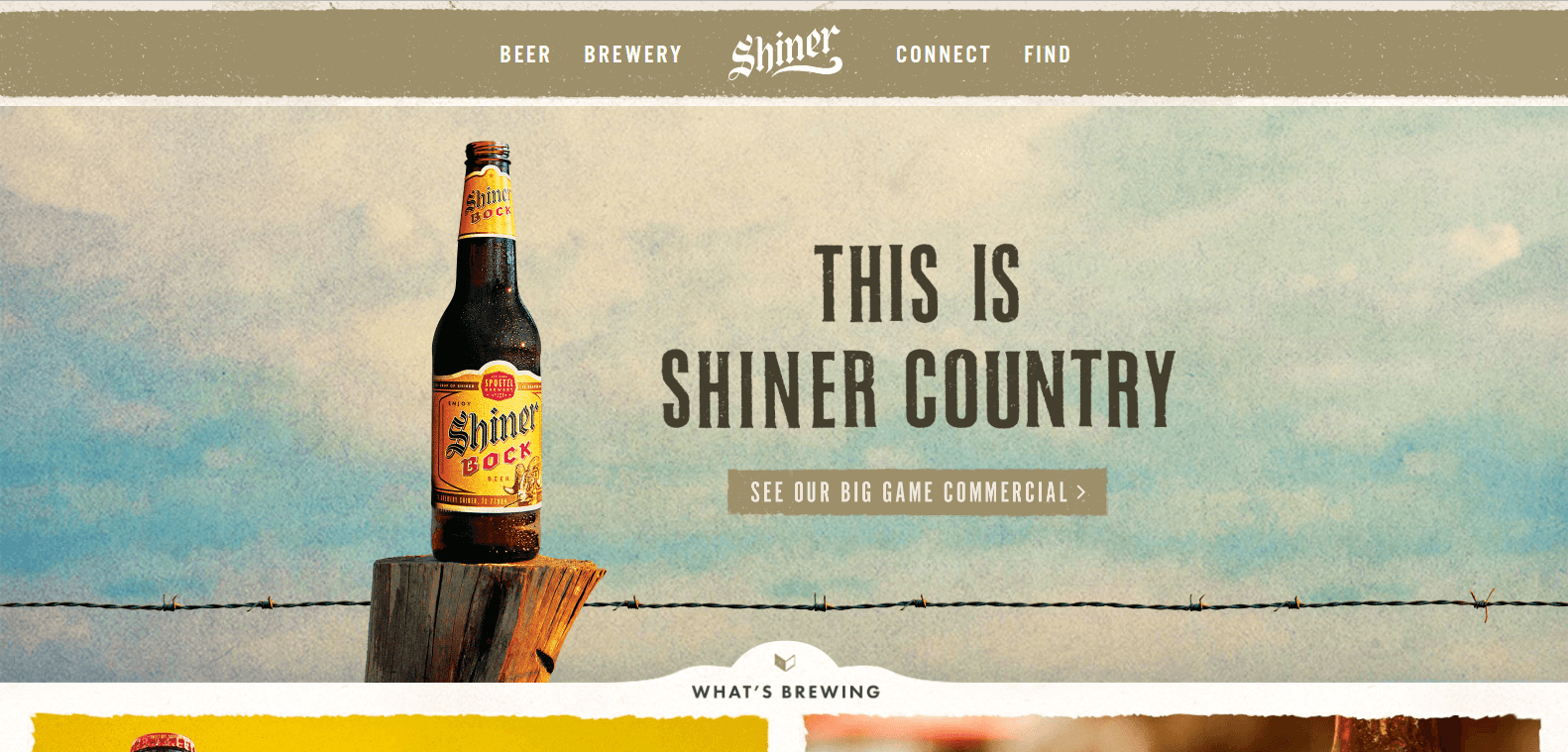
Example: Shiner, a Texas-based brewery. Shiner’s website is a great reflection of their brand, which is heavily influenced by its roots as a century-old brewery located in the American West.

Website Elements that Should be on Every Site
While the aesthetic portion of web design ideas will vary, we believe that these elements should be present on every site:
- User-friendliness (as we mentioned several times before)
- Mobile device compatibility
- Marketing funnel built-in
Remember, your company’s website ultimately serves the purpose of fulfilling business goals. If it can’t, it’s virtually useless.


