It’s not easy coming up with inspiration for a website. While you probably have a few ideas in your head, it can be difficult to figure out exactly what you would like your new site to look like. For anyone considering a redesign, these three cool website designs will help to get the creative juices flowing.
Learn a Thing or Two from these Cool Website Designs
1) Microsoft Story Labs

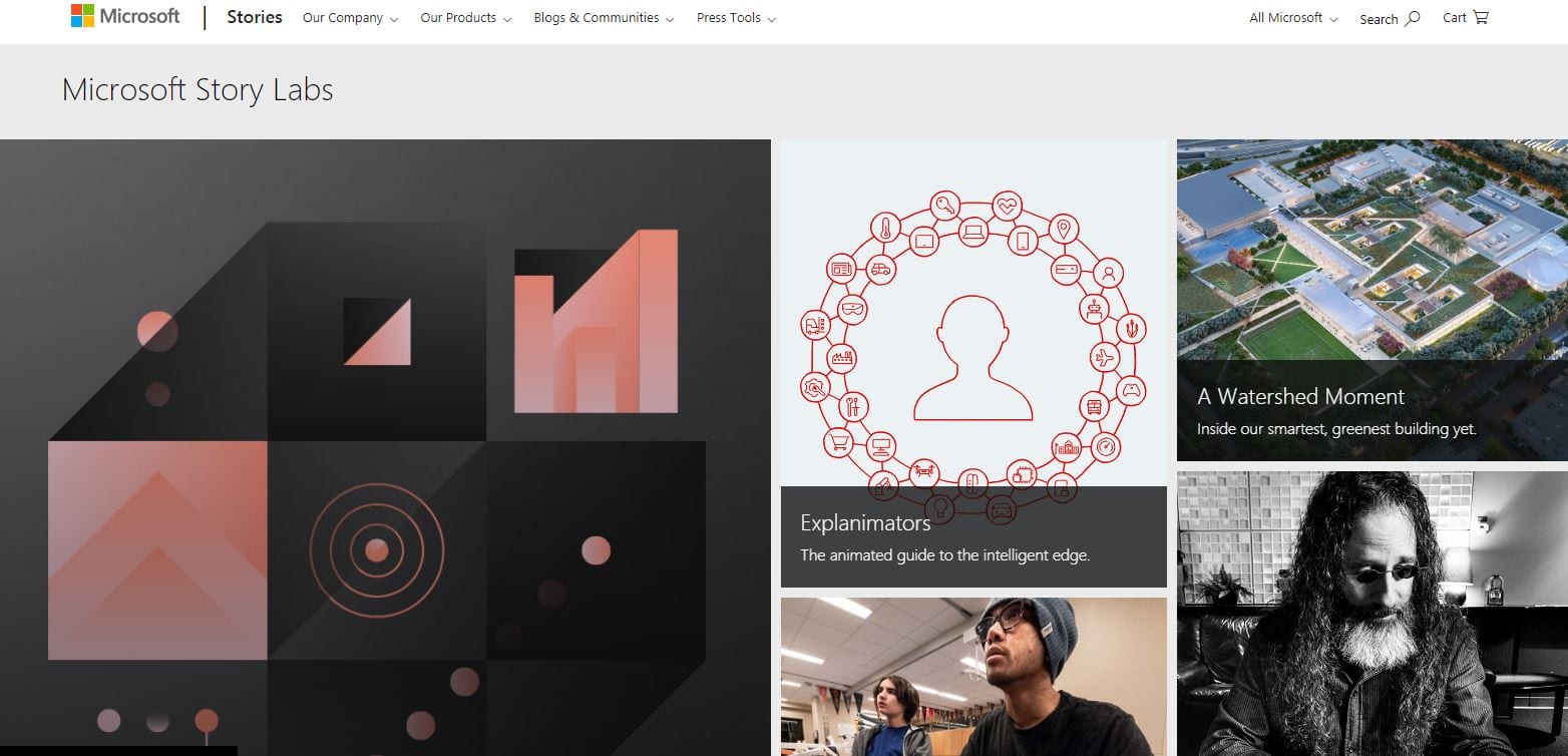
Microsoft Story Labs is a new site that grabbed our eye right away. The computer software giant uses this portal to tell stories about its own company. In its design, Microsoft offers a cohesive package that both informs and entertains.
3 Things We Like
- It features a grid of large, clickable pictures that each link out an individual page on the site.
- The photo at the top-left directs a visitor to an interactive web page, which then tells a series of stories about the history of the Microsoft brand.
- The homepage also has easy points of access to a podcast, employee profiles and other content features.
2) Swallowtail Tea

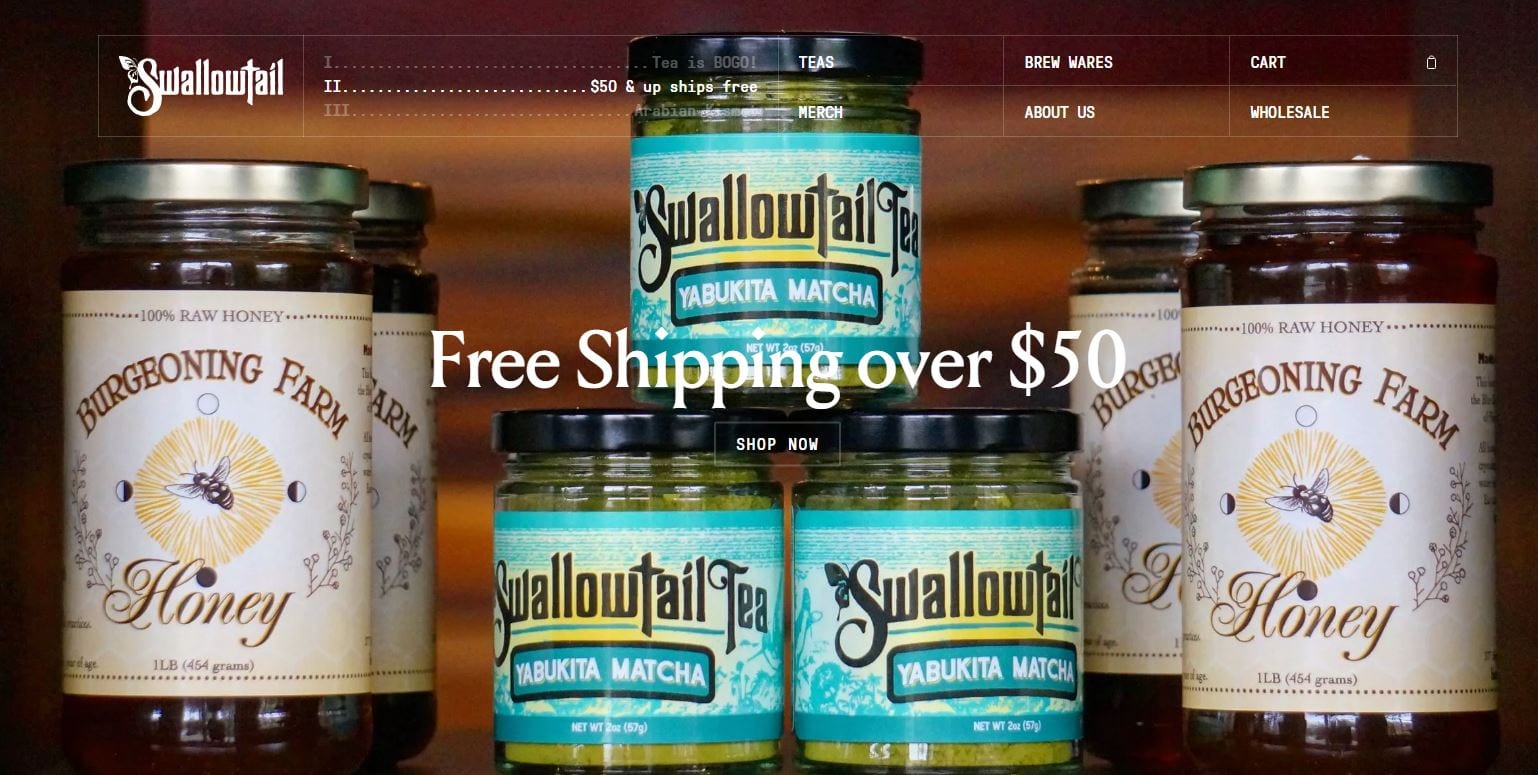
Swallowtail Tea’s website stands out because it is different than the rest.
The homepage’s extra-large, close-up pictures of the product’s packaging immediately grabs your attention. Unlike many other brands, its logo and site navigation appear to be more of an afterthought. Swallowtail Tea’s call-to-action at the center of the page attracts a visitor’s attention.
If you scroll down the page, you will see many more inviting photographs that offer entry points to other parts of the site. Throughout the website, Swallowtail Tea uses a retro font that jumps off the white background and complements the brand’s hip product line.
3) Lemonade

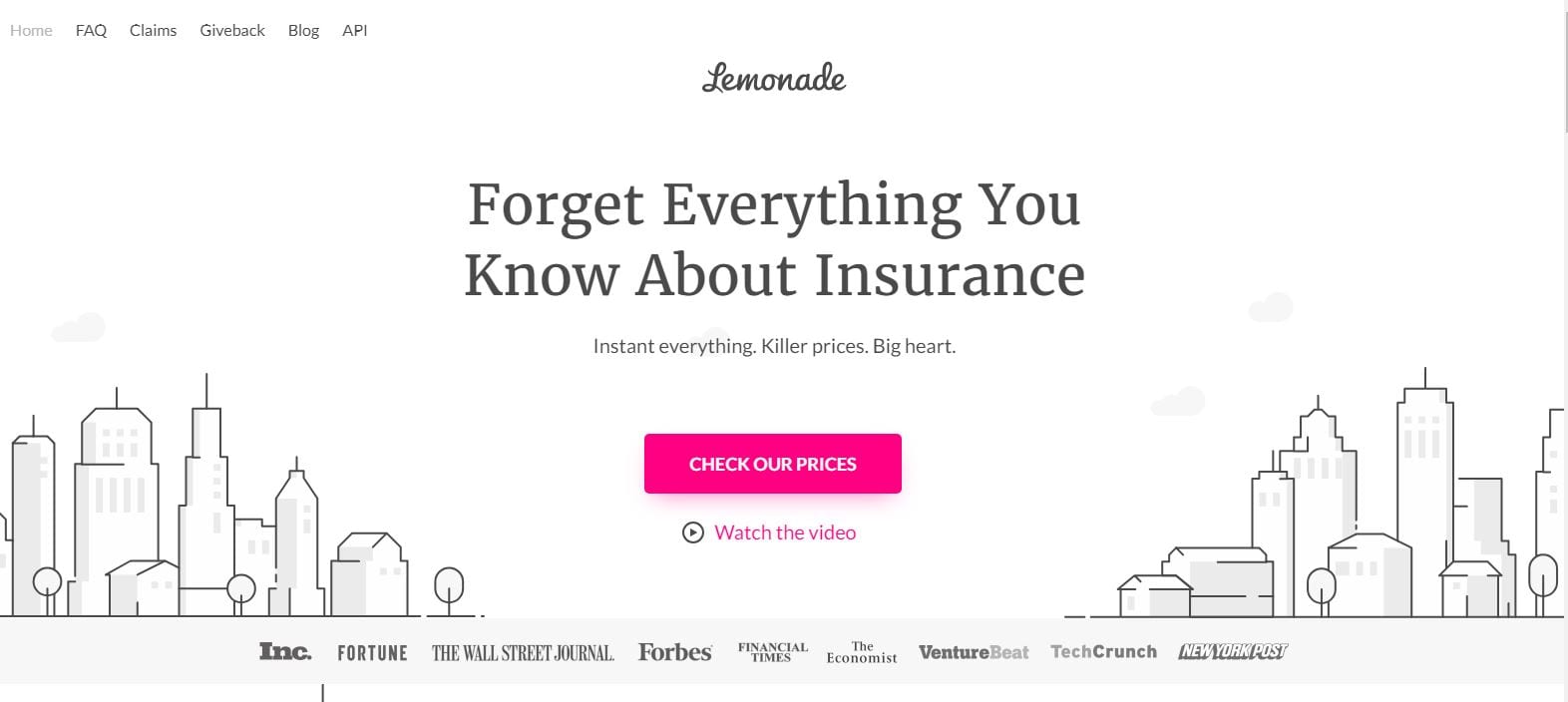
Lemonade, which specializes in home and renters’ insurance, takes a different web design approach: black and white graphics.
However, the site’s minimalist look immediately doesn’t just stand out for its lack of color. It has a function, too. The black and white theme is used to direct visitors’ attention to a can’t-miss, pink call-to-action button in the center of its homepage.
Although there is a small navigation at the top left of the page, Lemonade’s visitors can learn more about the product by scrolling down an elongated home page. Throughout the site, the only things that are in color are links to check for insurance rates, a strategy to increase the click-through-rate.
Even though there are millions of sites on the web, there aren’t nearly as many really cool website designs around. If you are redesigning your site, think about what you like and don’t like about these examples. If you have questions, consult a local web design pro.


