
With as much variety as there is in typography, the process of choosing the right fonts for your content is sometimes a lot more time-consuming than you may think. Design methods and composition have come a long way since the era of metal typesetting. These days, the web fonts that you choose have a significant impact on brand awareness and audience engagement—so keep these practices in mind.
How to Choose the Appropriate Web Fonts for your Business
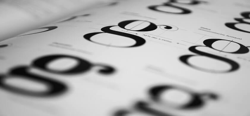
Readability
This one may seem like a no-brainer, yet there are still so many digital publishers that continue to display unreadable fonts. Whether it be microscopic sizes, incompatible colors, obscure typefaces or crammed line-heights, audiences will usually abandon content that they physically can’t read.
It doesn’t take much to review your content before publishing it. However, you can always consult a third-party for an outside opinion. They’ll be able to give valuable insight on the experience of a typical reader. If they find it difficult to maneuver, you know there is still work to be done.

Theme
When choosing the fonts for your site, you should pay close attention to how they correspond with the overall purpose or theme of your design. First, you should try to come up with some qualities that communicate and complement the message you’re trying to get across.
At their core, every available font has its own unique mood or personality. For instance, there are some that convey humor, playfulness, seriousness, sophistication, professionalism, you name it—there is a font for every emotion.
When the web font you choose does not correspond to the complete design and tone of your content, there will be a huge visual disconnect for readers, your intended message will fall short and you’ll miss out on a prime branding opportunity.

Finding the Right Balance
Inevitably, there are going to be times when you must combine two or more typefaces together within the same web page. When you blend fonts, it ensures that your site doesn’t become repetitive and boring and, in turn, lose readers.
For instance, web publishers will often use different kinds of fonts to create the look of a distinct visual hierarchy where body text, subtitles and headings are separated. This will help guide the eyes of your viewers and show what text is most important.

Also, it’s good to have at least some shared qualities between the fonts that you choose since clashing typefaces can often doom a web page. Instead, choose a similar detail like letter height or width. The balance between the two will create visual harmony.
Choosing the ideal web fonts for your site requires a lot of time and effort to perfect, which is why you may want to hire a professional web designer to take care of it!