A lot goes into a website that actually provides your business with a worthwhile return on investment. This includes search engine optimization, mobile-responsiveness and, of course, aesthetics. Understanding the difference between material design and flat design may provide you with some inspiration for your site.
What is Material Design?
Material design is Google’s “visual language.” It combines a set of guidelines predetermined by Google that work together to create a unified brand experience. It’s actually intended for app developers, but it’s commonly incorporated into web design, too.
3 Key Elements of Material Design
Realistic Visuals
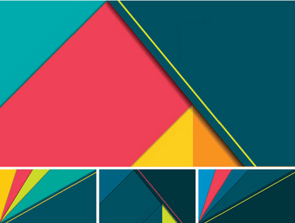
Google’s design language is inspired by the way things look in real life, meaning that sometimes, they’re three-dimensional. Elements on a webpage will have different heights and textures, and even cast shadows.
This form of realism is sometimes known as “skeuomorphism.”
Bold, Vivid Color
Each element on a webpage will have a clear, distinct color, making it extremely easy for the eye to define hierarchies. Confusing combinations that consist of several shades of one color may distort which parts of the page are clickable, providing the user with a frustrating experience.

Meaningful Motions
Animation is used to highlight clickable elements. Each movement mirrors the physical world and helps to define the path you want your website visitors to take. Since it’s inspired by real life, elements can stack or bounce off of one another, but not pass through each other.
Note that animation is not always a good thing. Too many animated elements can reduce the speed at which a webpage loads and be distracting, which also harms user experience.
A “Tactile Interface”
The above key elements of material design are meant to come together to create what some designers have dubbed a “tactile interface.” That means it looks like if you tapped your screen, you’d actually be able to feel different textures of each element.
Since it seeks to mirror the real world as closely as possible, occasional sacrifices in user experience may be made.
What is Flat Design?
Flat design is a minimalistic approach that values usability above all else. Many designers interpret it as direct backlash against realistic design because it doesn’t try to reproduce the physical world—it’s strictly digital.
3 Key Elements of Flat Design
Minimalism
There are no 3D effects or entertaining animations in flat design. It relies on the notion that realistic, skeuomorphic design is too busy, which is distracting for the user. Fewer bells and whistles makes for an easier user path.
Engaging Color Palettes
Similarly to material design, flat design makes use of vivid colors that are easily distinguishable from one another, for the same reason: it helps users easily figure out which elements are clickable and which ones aren’t.

Focus on Words
Since flat design is minimalistic, typography and written content become the focal points of each webpage. This makes it perfect for websites that are intended to inform, rather than entertain, their visitors.
A Modern Interface
Finished flat design products have a crisp, modern feel that makes it extremely easy for the user to find what they’re looking for. They won’t have to wait for animations to finish before navigating the website, because they have full control in the first place.
Closing Remarks
There’s no law that dictates each and every website must use only material or flat design. They’re just two of many different design languages. They can be combined with each other, or any number of other schools of thought.
However, understanding the differences between the two may help you draw inspiration for your next website or redesign, making it easier to communicate with your web designer.

