Your website’s homepage is often the first thing related to your business that potential customers see. Of course, you want to make a positive, lasting first impression that will spark their interest enough for them to continue browsing your site. To give you a bit of inspiration, we’ve rounded up a few of the best homepages we’ve seen on the internet recently.
Breaking Down of the 3 Best Homepages for Design Inspiration
Chipotle
Let’s kick things off with a Fat Guy favorite, Chipotle.
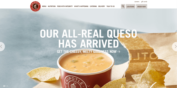
Upon visiting their website, you’ll first notice the image carousel that automatically rotates between mouthwatering images of their food and ingredients, accompanied by noticeable, yet not intrusive, calls-to-action. Attractive, purposeful visuals like these are a brilliant example of great above-the-fold content, which is anything you see on a webpage without scrolling farther down.
On the very top of the page, there is a clean, simple navigation bar that makes it easy to find exactly what you’re looking for on the site. Whether it’s the nearest restaurant, nutrition facts or contact information, it’s all at your fingertips.
Towards the bottom of the homepage, there are just a few more links to other, popular pages on the site. We’re fans of this because it makes the site easy to use, and provides a user-friendly experience for the visitor.
Nike
Global sporting goods dealer, Nike, has an ever-changing homepage that always reflects popular, trending topics, tastefully showcased in a contemporary design structure.
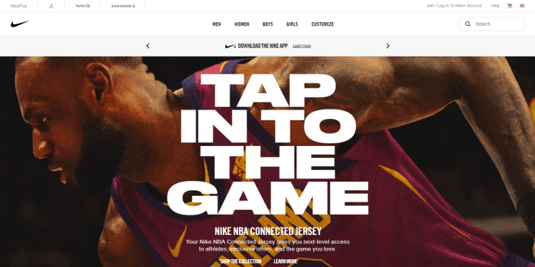
For example, at the time this blog is being written (in the midst of the NBA preseason), the homepage features a prominent photo of LeBron James in a Cleveland Cavaliers jersey above-the-fold, with several other NBA superstars in Nike gear a little farther down. Clicking any of the players brings you to a page containing Nike’s NBA apparel for sale.
When you scroll down, the navigation bar at the top of the page follows, making it easy to click any of Nike’s main shopping categories, or use the search bar. This is also known as “sticky navigation.”
This is what ecommerce websites should look like. Highly visual, relevant and with very few distractions. Whether people are looking for a specific product, or just to browse, they know exactly how to do so right from Nike’s homepage.
Oscar Health Insurance
Oscar, a company that’s truly dedicated to providing people with low-cost health insurance and care, does a really good job of adding a warm, human aspect to an industry that’s often hard to deal with.
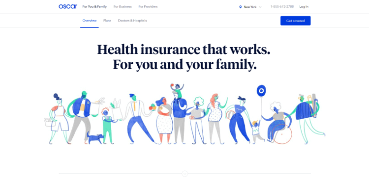
This can be seen on their homepage, which takes a straightforward approach to telling visitors how Oscar will save time and money for them and their families. It also includes a video featuring their concierge team, putting faces to the names of the people who take care of Oscar members.
And, finally, the homepage has subtle calls-to-action that capture user data for future marketing endeavors. There are two small, blue buttons at the top and bottom of the page, labeled “Get Covered,” that provide users with insurance quotes in exchange for some contact information. This perfect balance between useful information and lead generation tools make it one of the best homepages we’ve ever seen.
Depending on a website’s goals, the elements of its homepage will vary. However, all of the best homepages have interesting above-the-fold content, excellent visuals and strategic calls-to-action.
