Just like marketing, the field of web design is always changing to keep up with new technologies and consumer behaviors. From unique features and simple layouts to full video backgrounds, here is a look at some of the web design trends that we can expect to see more of throughout 2016.
2016 Web Design Trends
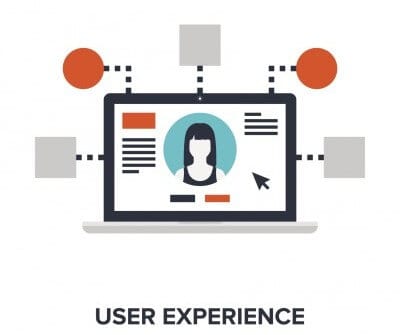
Overall, we can say that the most popular web design trends of 2016 will help to create an ideal user experience across all devices. It’s about personalizing your website to create a personal, unique connection with visitors. You will begin to see more custom, well thought-out websites that capture the user’s attention and keep their interest for a longer period of time. Below are some of the top trends that we are predicting to see throughout this year.
Material Design
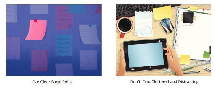
Material design is a visual language developed by Google. It is simply their idea of how websites and apps should appear on all types of devices in order to create a better user experience. Material design avoids the use of busy images that can distract the viewer. Instead, there should be a clear focus that combines vibrant and unexpected colors to convey a specific message. Below is an example of the dos and don’ts of material design.

Unique Typography and Vivid Colors
Use special typefaces to make a statement if there is a message that you want viewers to quickly notice. If done right, it can be a powerful way to communicate a message and create emotion. Special fonts should always be paired with a readable typeface to avoid making your website look cluttered and messy.
Along with unique typography, bright and bold colors create the perfect contrast on muted backgrounds. If you have web pages that lack visual effects, add a pop of color to control where the viewer focuses their attention.
Layout: Card-Style Interface
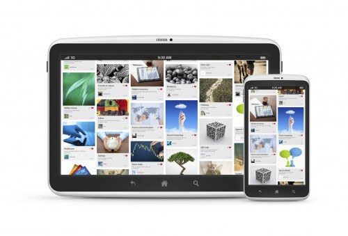
Similar to Pinterest, the card-style interface is expected to grow in 2016. It is a user friendly way to organize and display information, especially when there is a variety of products that you have to offer. This design is perfect for mobile because the boxes will stack across or down the screen depending on the device the website is being viewed on.
Animated Photos and Videos
Videos have become one of the most compelling forms of content, because it instantly engages users, which helps to boost conversion rates. Videos create the process of building trust between the visitor and your brand because of how easy they are to consume and digest. Even if you do not have any high quality videos to use on your website, consider using a cinemagraph, which is simply just a picture that moves. It’s a great way to add personality to your brand and give your audience a better understanding of what you are all about.
Less Stock Photos, More Illustrations
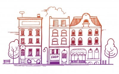
One of the biggest web design trends of 2016 that you will begin to notice is illustrations and sketches. Rather than generic stock images, illustrations can add a fun element to the design of any website. The photos that are used on your website should capture the actual service or products that you provide to authentically represent your brand.
Needless to say, the web design trends for 2016 really aim to make the user’s experience a main priority.


