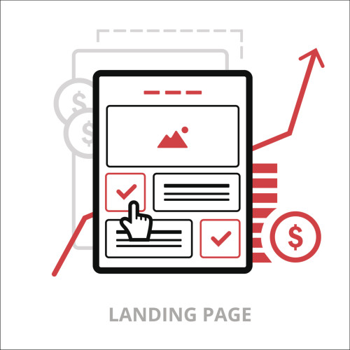
What is a Landing Page?
A landing page is single webpage that is separate from your website, which is designed to capture user data. According to Content Marketing Institute, “the goal is to get a consumer of your content to take another step toward becoming a customer.” Unlike your website, a landing page has a specific objective, which can include a description of an offer such as an Ebook, whitepaper or discount.
The message on your landing page is targeted to reach potential consumers who would find interest in your offer. In order to receive the offer, they will need to fill out a form on the landing page which will allow you to capture their information, such as their name and email address.
Why Should I use Landing Pages?
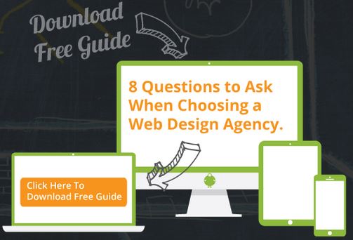
Landing pages help increase your conversion rates. Every time a visitor fills out a form, they are performing a ‘desired action,’ also known as a ‘conversion.’ This is a great way to track if your marketing efforts are working. Here is an example of how Fat Guy Media gets a visitor to a landing page. On our website, at the bottom of our Website Design page, there is a call-to-action (CTA) button that describes an offer to the reader.
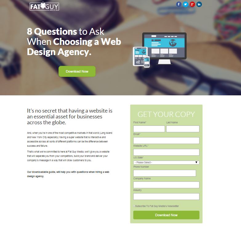
When the user clicks on a CTA button, it will take them directly to a landing page, which includes all of the essential landing page best practices, such as a bold description and form.
Landing Page Best Practices
In order to capture potential customer data, you will need to have certain elements on your landing page. Below are some tips for landing page best practices.
Headline
This is the first thing that visitors will see, and you want them to know that they were directed to the right page. There should be a bold headline that matches what the user originally clicked on. If necessary, you can add a supporting subheader with a persuasive message to support your offer.
Photo or Video
There should always be a visual element to your landing page that reflects the offer that you are describing to the visitor. It can help them to gain a better understanding of what they are reading and depending on the complexity of the offer, you can even add a video.
Introductory Content
Following the headline, you will need to provide the reader with more details about the offer. There should not be too much text, or you could lose the reader’s interest, so stick to one or two summary paragraphs or bullet points. Highlight the benefits and features of your offer, and how it can provide value to the visitor.
Closing Argument
This is a bold, yet simple statement that reinforces the purpose of the offer and how it can provide value to the user. For example, our landing page ends with a closing statement describing how our downloadable guide will help answer questions when hiring a web design agency.
Call-To-Action (CTA)
This is one of the most important landing page practices to follow. After providing the reader with details on the offer, you need to have a call-to-action, such as a form, which represents your page’s conversion goal. Clarify the purpose of the form and what the user will receive in exchange for providing their personal data. There can also be more than one CTA placed on your landing page, which Fat Guy Media chose to do by adding a “download now” button after the main headline as well as at the bottom of the form.
If you follow these landing page best practices, you can be that much closer of increasing your marketing conversion rate!

