Deciding on a website redesign can be a big step. A big investment. And, a bit confusing. As you start considering what you want your website to look like and what you want it to do you may find yourself wondering, what makes a well-designed website? It’s a good question. The only problem is there is no consensus over what makes a good website. With so many differing opinions out there it can be difficult to design a website on your own without contradicting one of those opinions (what if you conform to the wrong one?). Hiring a web design team can take the design burden off of your back, allowing you to focus on what you want your website to do, not how to do it. But, to answer your question we’ve come up with a list of traits (with some help from Hubspot) that most well designed sites have. The list should help better the conversation you have with our web team as we work together to build the best website for your business.
3 Tips for Your Next Website Redesign
1. Keep it Flat
3D may look really cool in PIXAR shorts and when you’re making models of supercars but when you’re designing a website it can detract from the flow of your website. You want a pleasant visual experience for your site, not one that confuses your potential customers. A website redesign that focuses on 2D design and illustrations will keep the focus on your content and less on the bells and whistles. The best designed sites affect you subconsciously, you shouldn’t be going, “WOW! That was a really well designed webpage.” So keep it simple and keep it flat. We’ll come up with some illustrations, designs and photo assets (all 2D of course) that will make your site aesthetically pleasing and help with your sales.
2. Let Your Typography Speak for You
Getting a font that has been designed specifically for your business can be a blessing or a curse depending on your final website redesign. We don’t do unique typography in-house but we would be happy to look at a unique font that a typographer designed for you. Even if you can’t get a hold of a typographer that’s fine as well. Our website redesign team will work with you to come up with a font that makes sense for your industry, your brand and one that also matches current industry trends.
3. Go Big or Go Home (and Make it Responsive)
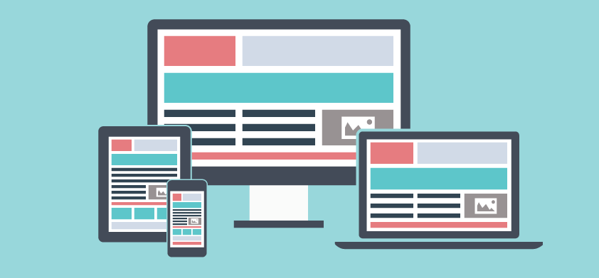
Getting people to look at images and illustrations is much easier than getting them to read your content. Those illustrations should be focused on translating your brand message from words into images which will allow customers to understand what you do without having to do too much research. Customers should also be able to access those images from any of their web enabled devices (smartphone, tablet, computer, etc.). Responsive design is an essential design attribute for your website redesign with so many users accessing the Internet from devices other than their personal computer. We’ll make sure your website is responsive and that the images that are included on that site tell your brand story. A quality website redesign can work wonders for your business as it boosts web traffic and turns that traffic into leads. All you have to do is close. If you have any further questions about web design please feel free to contact us at 516-535-5353 or e-mail us at sales@fatguymedia.com. 

