Today smartphones account for 80 percent of Internet searches, so if your company does not have a responsive website, then you may have a problem. A responsive website provides an optimal viewing experience for the user, regardless of the display device. This means that the layout of your website will adjust to the size of the device that the visitor is using without the loss of any functions. To compete with the best responsive websites you will need to feature the following web design elements as you use design to convert leads into sales.
Is Your Website Responsive?
We all know how important it is to get a visitor to your site, so if they finally get there but automatically leave because the site is not mobile-friendly, then this is a major issue. As we have mentioned numerous times before, it is highly imperative to have a responsive site due to Mobilegeddon. Google has made it mandatory for all websites to be responsive in order to get ranked on search engines. So, the first thing you must do after reading this blog is to check if your site is mobile ready with Google’s mobile-friendly test.
The Best Responsive Websites Will Include These Features
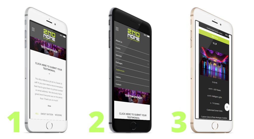
Below is one of the recent websites that Fat Guy Media designed for 2nd to None Entertainment. All of the features that make up the best responsive sites have been implemented, which we have broken down to help give you a better understanding.
Figure 1
- Liquid Layouts:If you go to 2nd to None Entertainment’s website on your desktop, you’ll notice that the page sits nicely in your wide web browser. Adjust the width of your browser and you’ll notice the layout changes to become more optimal for mobile viewing.
- White Space:White space, also referred to as negative space, is the portion of the page left unmarked. Keeping your web site clean and simple helps direct a visitor’s eye towards the element you would most like them to see. So, be sure to have your visual hierarchy mapped out before you begin your design. If you glance at Fig. 1 the first thing that will pop out at you is “Click Here to Submit Your Testimonial.” Why? See the negative space that surrounds that little block of text.
- Above the Fold: Above the fold refers to the portion of the page visible without scrolling. This design term got its’ start in the newspaper business where all of the top articles and information were placed in the top section of the folded paper. See “Click Here to Submit Your Testimonial” in Fig. 1.
Figure 2
- Responsive Navigation:A hamburger menu (three horizontal lines in the top left corner of Fig. 2) allows you to keep navigation simple and consistent across all devices. Notice the difference between Fig. 1 (the collapsed menu) and Fig. 2 (where the menu has been opened). While most people will be clicking on the links included in your content, the hamburger menu gives your visitors a chance to explore the rest of your website.
- Page Speed: We’ve all fallen victim to slow loading pages. Search engines favor pages that display their content quickly. You can make your website faster by enabling compression, reducing redirects and optimizing images.
Figure 3
- Responsive Images: Images should be able to adapt to any size device, but certain elements can be removed for easy-viewing and a clearer layout on smaller devices. You’ll be able to edit the responsiveness of an image by adding a few markups to the images on your website (again, this is on the back end).
- ‘Top of Page’: The arrow icon in the bottom-right corner allows the user to instantly go back to the top of the website page with just one tap instead of having to manually scroll back to the beginning of your content.
The best responsive websites exhibit all of these practices. Practices that allow your customers to seamlessly engage with your content on their smartphones, tablets and desktop computers. An improved user experience will not only benefit the customer, it will boost your ability to convert leads into sales. 


