So, you need a new website, but you’re having trouble putting into words exactly what you want it to look like. You’re not alone. To help give you some direction, we’ve compiled a few examples of web design inspiration that tend to reflect our clients’ preferences.
Note: the following websites are all a matter of taste. Everyone has different preferences, and the goal of this blog is to give you a reference for your own website, not tell you that one style of design is inherently better than another.
5 Pieces of Web Design Inspiration we Think You’ll Love
Photography-Based Visuals
Photos, as opposed to illustrations, depict things that are real. If your business sells physical products, you may opt to use actual photos of them on your website. If your business is service-based, you may still feel that photos best reflect your brand. It’s a matter of opinion.
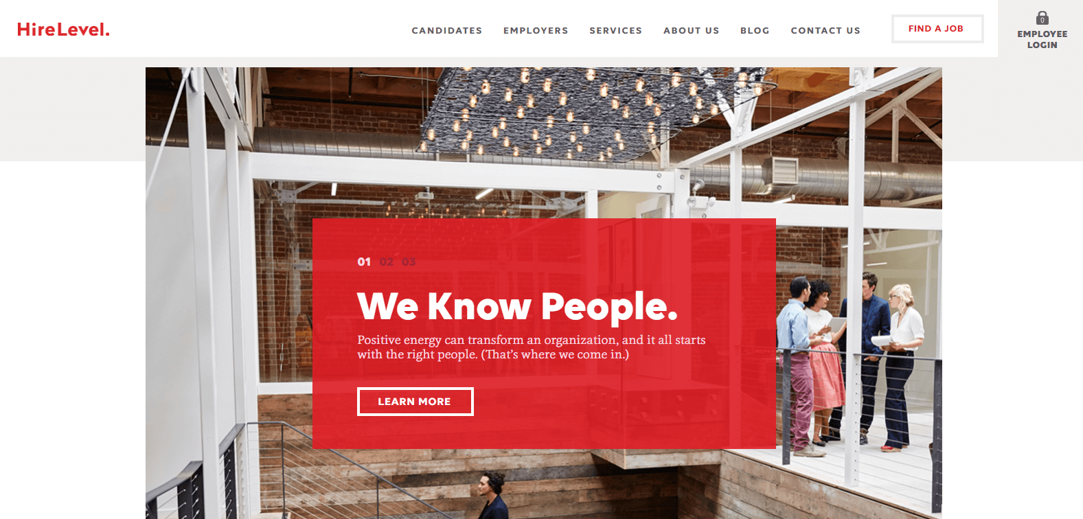
HireLevel, a service that connects employers and people looking for work, does an excellent job of sprinkling photography throughout their site. Their service is all about bringing people together, after all. So, it only makes sense that there are plenty of photos of people!
Illustrative Visuals
Illustrated visuals are bound only by the creativity of the designer. Literally anything can be illustrated, and, as a result, companies centered on innovation and creativity often tend to use a lot of illustrations.
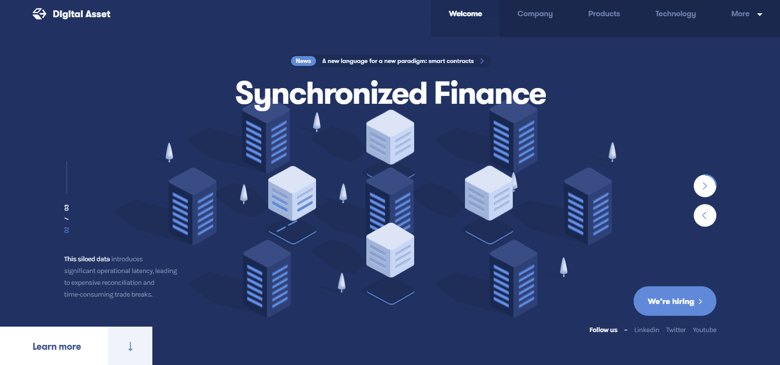
Take Digital Asset, for example. Their service is all about revolutionizing the way financial institutions manage ledgers. This is reflected in their highly-imaginative website that makes use of futuristic-looking illustrations and animations.
Purely Professional
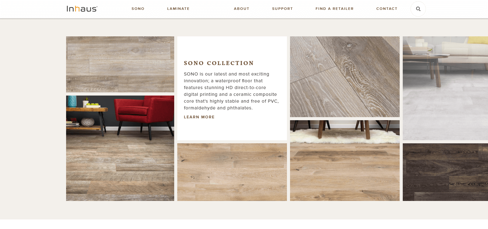
Inhaus is a Germany-based manufacturer of flooring materials, and their website is amazing. It’s clean and simple, using ample whitespace and images that supplement, not distract from, the written content.
The navigation bar at the top of each page has just a few options, making it really easy to find what you’re looking for. It also follows you down the page, so you don’t have to scroll back up to navigate to a new one. This is known as a “sticky navigation,” and it’s highly recommended for all websites.
Focused on Fun
You didn’t think we’d compile a web design inspiration list without mentioning food at least once, did you?
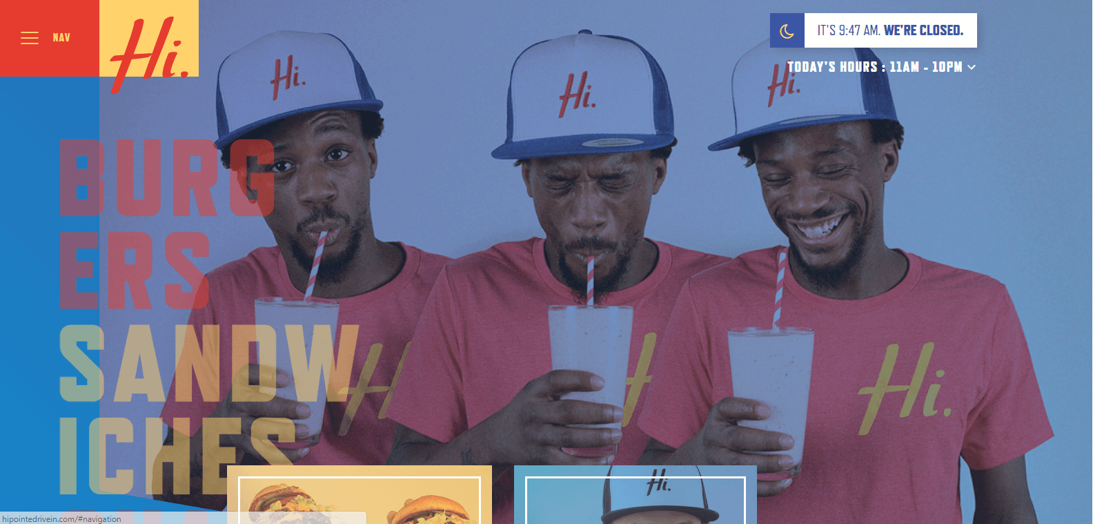
Hi-Pointe Drive-In is a St. Louis-based burger and sandwich joint whose website looks as good as its food. The homepage has a playful color palette and is full of fun photos that just make Hi-Pointe look like an awesome place to eat. There are mouthwatering photos of food throughout.
Overall, it really makes us want to book a trip to St. Louis.
Minimalistic
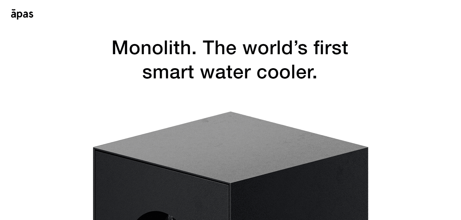
Monolith is the “world’s first smart water cooler.” It connects to your smartphone to give you reminders to drink enough water throughout the day. It also tells you when it’s time to replace the bottle or service the cooler.
As fancy as it sounds, at the end of the day, it has one simple function: to dispense water. Monolith’s website reflects this, with its minimalistic black and white colors and barebones font. It gets the point across succinctly.
There’s so much incredible web design inspiration around the internet, and these are just five examples. Which websites inspire you?


