Most people use the terms font and typeface interchangeably, but (as your friendly neighborhood graphic designer will tell you) these words are not synonymous.
Typeface is the umbrella term for fonts. There are different fonts within each typeface. For example, Avenir is a typeface, while Avenir Heavy 25pt is a font within that typeface. Now that we’ve established what a typeface is let’s help you pick out the right one for you. We’ve included links to some free fonts along the way, so be sure to download those as you go!
WHAT IS A TYPEFACE? IMPORTANT VOCAB TO KNOW
Before we dig into how to choose the right typeface it’s important to understand the fundamental vocabulary terms used to describe type.
- Serif – any of the short lines stemming from and at an angle to the upper and lower ends of the strokes of a letter
- Sans-serif – a letter or typeface with no serifs (see serifs)
- Tracking – the space between groups of letters
- Kerning – the space between individual letters
- Leading – the spacing between baselines of type
WHICH TYPEFACE SHOULD I USE?
Serif
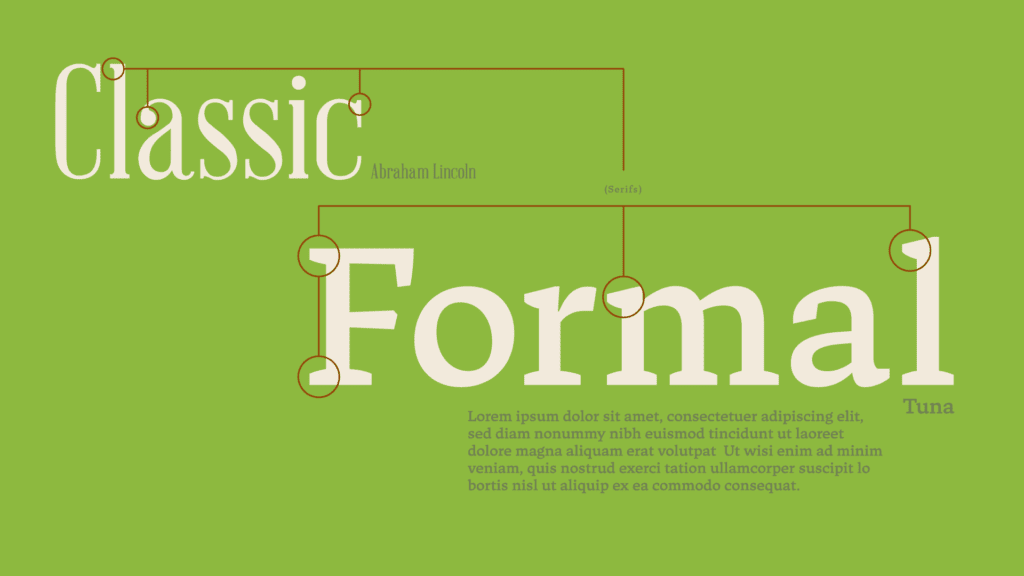
If you wanted to proceed in a more classic and formal direction, then you may want to choose a typeface with serifs. These are the little feet on the end of the letter-forms (indicated by the circled sections in the graphic below).
Sans-Serif
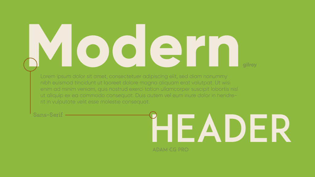
On the other hand, sans-serif fonts will always look more crisp, fresh and modern. Sans- serif simply means “without serifs” so the letters don’t have these adorable little feet on the ends of each letter-form.
- Gilroy Extrabold
- Adam CG Pro
PAGE LAYOUT FUNDAMENTALS
How to Format a Page
When you’re laying out a page you usually have fixed dimensions and a lot to say. If you crowd too much information in one area then your copy may become unreadable. To avoid crowding, designers lay out the content via a visual hierarchy (i.e. what is the most important thing that needs to be said).
In its’ simplest form, these written elements are broken up into headers, sub-headers and body type.
- Headers – also referred to as display type this is the largest text on the page
- Sub-headers – slightly smaller than the header
- Body type – the block of text that holds your story. For this you’ll want to choose something that’s super easy for people to read through.
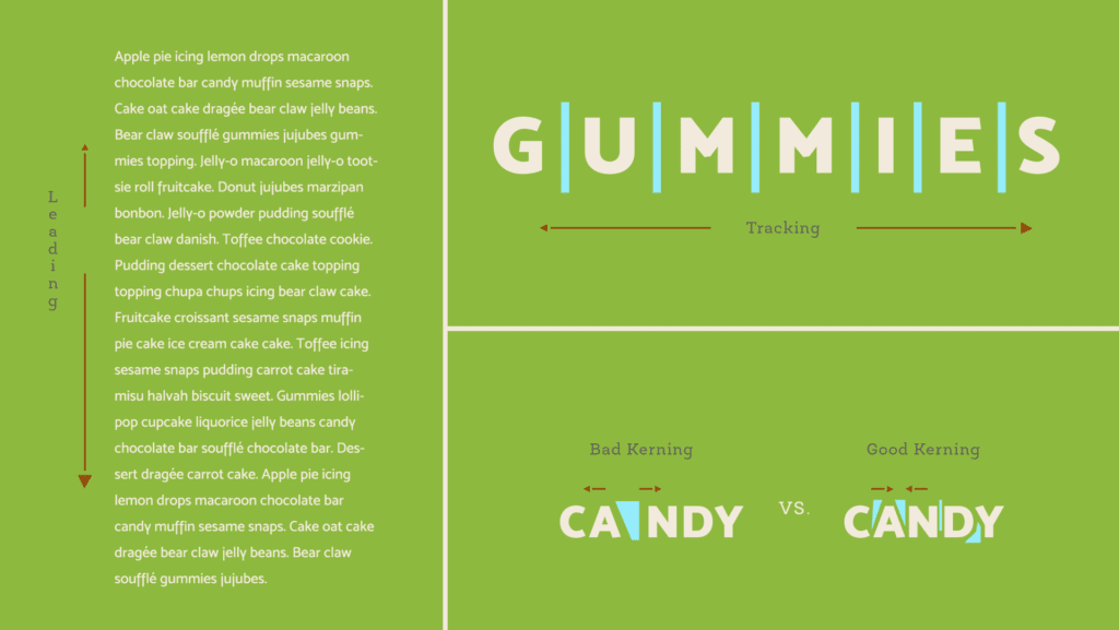
With the visual hierarchy established you may need to play with the font weight, tracking, kerning and leading to give everything the right amount of space and contrast. These principles will help you lay out a page that is both readable and pleasing to the user. For some layout inspiration check out these designs from inspirationhut.net.
THE WRAP UP
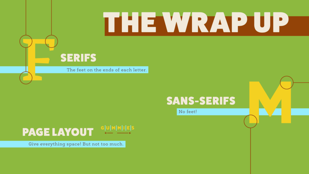
Congratulations! You are now a certified typography connoisseur! You know the difference between serifs and sans-serif typefaces, the fundamentals of page layout and can identify what a typeface is. In this lesson we purposely used typefaces that are free to download, so be sure to do so. Best of luck!
