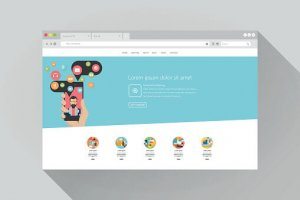
For the vast majority of visitors, your homepage will be the first time they come across your brand—so don’t take this opportunity lightly. Dedicate valuable time and resources to ensure that your homepage design is always properly optimized and includes these essential components.
How to Craft your Website’s Homepage Design
Above the Fold
According to Time, the average visitor spends less than 15 seconds total on websites. What does this mean? Make sure that your message is clear and concise.
As a digital content provider, you need to make the most of the short time you have to capture a visitor’s attention by focusing on content above the fold—the portion of a webpage that is visible when a user first navigates to your site without scrolling.
Above the fold content is what visitors will see first. This section needs to set a great first impression. Use this area on your homepage to display an important, attention-catching message to keep visitors interested and engaged. Remember, you only have 15 seconds—make it count!

Your Site at a Glance
Your website’s homepage design should always contain a brief, succinct overview of what your business is about and what they can expect from your site.
Mainly, it should answer the basic questions that a customer may ask, such as: “Who you are,” “What you do” and “What value can the user get out of your site.” Besides, visitors won’t usually navigate any further if they are still unclear about what you website offers.

Easy-to-Use Navigation
Your website’s navigation is also one of the most important aspects of your homepage design. Ideally, your navigation should be easy to find and simple to use. After all, it’s what allows visitors to quickly find what they are looking for.
Also, remember to keep the number of items contained in your navigation bar under seven, at most. It’s best to use simple labels and lay everything out in a logical order. If you find that you have too much content to cut down, you can always use a dropdown menu.

Visual Hierarchy
Another way you can seamlessly capture a visitor’s attention is by using a strong visual hierarchy to arrange your content by importance. This includes the addition of images, headlines, subheadings and bulleted lists to briefly describe the benefits of your service and/or products.
Furthermore, you can use well-written, eye-catching calls-to-action (CTA) on your homepage to direct visitors to certain pages for more information.
If you’re a brand looking to stand out from your competitors, start by optimizing your website’s homepage design to attract and appeal to visitors.


