It is essential to do some research into what makes a good website. What fundamental elements should be incorporated, who is your audience, and how can you stand out? Then you need to craft it around your industry and ensure you align with specific standards while also making sure your site is optimized for search engines.
This article will discuss tips on how to design a financial website to promote the company in a positive light.
Part of What Makes a Good Website are the Details
One of the most important things to consider when building a financial website is that it complies with guidelines regarding content. Financial companies are subject to standards about how their services are presented and the kind of information they can share.
This includes, but is not limited to, ensuring that all information displayed is accurate and up-to-date, avoiding any potentially misleading statements, and disclosing any material risks. For example, the site must avoid making promises, optimistic projections, and vagueness that may be misinterpreted. In addition, any disclaimers or disclosures must be visible, easily understood, and not hidden.
By taking these precautions, companies can help build user trust and ensure that their site provides a safe and reliable experience for all visitors
Design and Functionality
In addition to compliance with content guidelines, other considerations include design and functionality. A well-designed and user-friendly site will help to ensure that visitors can find the information they need and navigate the site with ease.
In all website design, you want to ensure web accessibility is taken into consideration. This means that sites, tools, and technologies are designed and developed for people with disabilities. Additionally, you want your site to perform at a high level, with fast loading pages and functionality on multiple types of devices.
The more engaging the site design is, the lower the risk of bounce rate becomes. This can help turn visitors into customers.
Interactive Videos
Interactive videos can help explain complex financial concepts clearly and concisely. They can also engage visitors and encourage them to take action.
When considering how to use interactive videos on the website, be sure to consider the following:
- Audience: Who will be watching the videos? What level of financial knowledge do they have? What are their needs and interests?
- Goals: What should the videos achieve? Do you want to educate viewers about a particular financial concept? Do you want to encourage them to take action?
- Budget: How much money is the company willing to spend on production and distribution?
By carefully considering these factors, you can ensure that interactive videos are effective and cost-efficient.
Diagrams and Charts
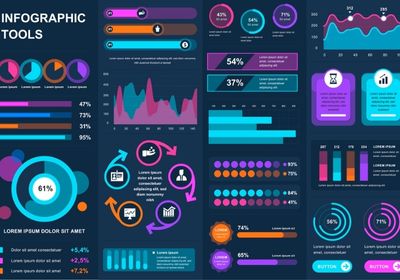
What makes a good financial website stand out from others is the use of diagrams and charts. This is because people are likelier to engage with visual content that gives context to your website copy. The images can help to simplify complex information and make it more accessible to a broader audience. Plus, they add an element of interactivity to the site, making it more engaging overall.
An FAQ Page
Lastly, a detailed FAQ page can answer common questions that customers may have about the company and its products. It can also help to direct customers to the right areas of the website where they can find more information about specific products or services.
A well-organized FAQ page can help make the website more user-friendly and efficient for customers.
Summing up, your website should be easy to navigate, visually appealing, and, most importantly, professional and informative.
We can help you build a website that will cater to your company’s needs. Contact Fat Guy Media today!


