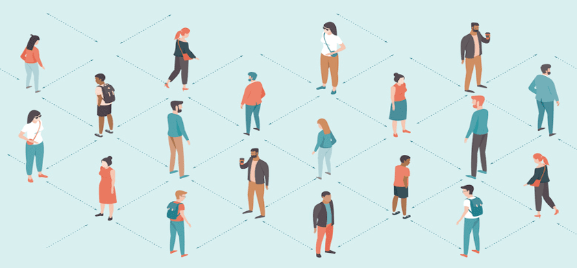
Considering our ongoing pandemic, people are using social distancing to stop the spread of coronavirus. For this reason, many brands are slightly altering their logos to promote and encourage this new cause. In fact, here are some of the most popular new socially distanced logos, including some very well-known brands.
Social Distancing Meets Branded Logo Design
Audi
Last week, German car manufacturer Audi was the first brand to give their logo a social distancing twist. Their four classic interlocking rings are no longer so interlocking. Audi decided to evenly space out the rings so that none are in contact with each other.
They unveiled the new logo in a video clip that closed with the message: “Keep your distance. Stay together.”
Volkswagen
Not to mention, Audi’s parent company, Volkswagen, also followed suit with their own logo. Their new and improved symbol included the usual V and W, except they significantly increased the distance between them.
Audi, Mercedes, and VW — social distancing. #COVID19 pic.twitter.com/vRsp0t9Aun
— Wojtek Pietrusiewicz (@morid1n) April 2, 2020
Coca-Cola
As they always do with current events, Coca-Cola also chimed in with a logo redesign to advocate social distancing.
Their logo, in which Coca-Cola’s letters are separated, appeared on a billboard in an unusually empty Times Square. It was presented with the inspiring slogan of “Staying apart is the best way to stay connected.”
Coke puts social distancing message in Times Square https://t.co/Bf3Nen1RXr pic.twitter.com/8dJPJf3TuL
— Ad Age (@adage) March 23, 2020
McDonald’s
Everyone knows the iconic McDonald’s golden arches. However, due to social distancing guidelines, McDonald’s Brazil has separated the arches. Now, they’re each standing alone. According to the agency that reconceived the logo, the message is that we are “separated for a moment so that we can always be together.”
McDonald's separates its golden arches in an act of coronavirus solidarity https://t.co/oVecZOg2PI pic.twitter.com/6hklHAbT8D
— Ad Age (@adage) March 21, 2020
However, the new unveiling wasn’t all sunshine and rainbows. Some critics and users online were quick to point out how the brand has been treating its workers. After people painted them as opportunistic, the brand quietly removed all traces of the logo change. The lesson is that if your brand ever decides to promote a cause, just make sure there’s no way it can turn back on you!
In light of everything about social distancing logo design, it’s important to remember the overall message: to stay safe and separated!


