Web design nightmares never seem to end. In our drag-and-drop era, thousands of people are creating their own sites, and the results can be horrifying to varying degrees. This isn’t to say that every personally designed site is terrible. But many of them lack the features and sophistication of a professionally developed site, and poorly designed websites impact how your audience experiences your brand.
“Free” Website Builders Lend to Web Design Nightmares
With so many online options to build a free website, we have to wonder: What’s the catch? The truth is that many platforms use the word free to entice business owners to join, only to tack on hidden charges for additional features and greater design flexibility.
With a free account, you generally only have access to a limited number of web templates. The result is a website that looks like hundreds of others on the internet. Tools like this create a danger for site owners. Many will need help to make the site fit the tool instead of using the right tools for the site.
Let’s Look at the Do’s and Don’ts of Web Design
These are some ways to avoid all-too-common and costly web design nightmares:
Do: Make It Responsive
A responsive website is essential in today’s society. Your web page should not only look good displayed on a desktop. It needs to readily scale (adjust) to fit a desktop screen to a mobile device. Responsive web design is an art form; sometimes, ready-made templates aren’t cut out for the job. The goals posts are constantly changing, and you need to be able to adjust along with them quickly.
A professional web design team will take into account the best possible experience your user can have across multiple devices and optimize the design accordingly.
Don’t: Overcrowd Your Site
Imagine being a kid lost in the middle of a carnival. There’s nothing but a blur of color, noise, and chaos. It’s impossible to find which way to turn. Unfortunately, poorly designed sites feel exactly like this and lend to a poor user experience.
Customers will quickly lose focus and leave a site that feels overwhelming or crowded. Avoid jamming everything on a page, and instead opt for clean, systematic navigation that makes it a pleasure to spend time on your business’s site.
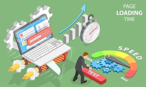
Do: Optimize for Load Times

Website speed is the number one reason people bounce off a site early. With a mere 1-second delay, you will get: (provided by crazyegg.com)
- 11% fewer views
- 16% decrease in customer satisfaction
- 7% loss in conversions
Potential customers, as well as existing ones, have a shallow threshold of tolerance for slow or non-responsive websites.
Professional web design firms can utilize compression and image optimization techniques to ensure your site loads lightning-fast and provides an excellent user experience.
Don’t: Create an Art Project
A colorful combination of fonts in varying sizes, an array of images, and creative use of white space may be fun to design, but everything needs to have a clear purpose and action tied to it. Your website must be designed with functionality in mind.
Nothing should be there solely for decoration. Designers know how to blend form and function effortlessly. They craft websites that capture your brand’s personality while still optimizing for purpose and conversions.
Do: Personalize Your Site

Establishing a website that reflects your brand’s unique value and personality is essential to long-term success. People remember how they felt visiting a site and associate that with how your product benefits them
Professional designers collaborate with you every step of the way. They consider your thoughts, ideas, and preferences with every design decision and counsel you through them. The goal is to build a site that fulfills all your customers’ expectations while embracing your vision.
Your website is a direct extension of your company and an integral part of operating it. Be sure to plan everything out and avoid any web design nightmare.
Contact Fat Guy Media and schedule a free consultation about building your dream site!


