
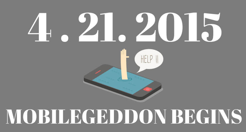
Google’s products and services are known for changing almost as often as the seasons do. Their algorithms? Well, those change just about as often (though you may not know it). On April 21st Google will launch their latest update that will make mobile optimization a necessity for all websites going forward.
Why is the Mobile Optimization Update Necessary?
Mobile optimization, or responsive website design has become a flashy term in the web design world. It is the process of taking a website and making it “responsive” to the different dimensions present on different devices. That way when you access a website from your iPhone, iPad or other similar products the website stays the same, and all of the information is exactly where you would expect to be. You won’t have to play hide and seek with certain parts of the navigation bar. While responsive design does result in a better user experience, it’s not the only reason Google has for making mobile optimization a deciding factor in search engine optimization. The main reason for this Google update has come from the trend towards mobile search. Anywhere you look, whether it’s at other drivers stuck in traffic, the man opposite you on the subway or at your local restaurant, you’ll probably see someone on their smartphone. They’re everywhere and as they have become more prevalent (and data rates have become less expensive), so too have mobile searches. With over 60% of Google searches being conducted from mobile devices, it only makes sense for the search engine to favor those sites that prefer a better user experience. Whether it was the Panda update, the Penguin update or any of the other cute animal-themed algorithms, Google wants to be the search engine that provides users with the best search results. That’s why they’ve always been two steps ahead of competitors like Yahoo and Bing. Unfortunately, when Google moves on so must your business. Without mobile optimization the website you worked so hard to make may see its page rank slip past the first page. And that’s when Mobilegeddon will truly be upon you. If you want to check if your site is mobile ready, here is a link to Google’s mobile friendly test.